Create without limits. Futura is the first photo editing app that combines the power of generative AI with intuitive simplicity, transforming your ideas into stunning creations with a single click, because every idea deserves to become a work of art.

01

Strategy

01

Strategy

01

Strategy

Who we are, what we stand for, where we’re going. Our brand strategy answers that and more, giving direction to everything we create on every touchpoints.

Brand foundations

View details

At the heart of every business lies a set of principles that define its values, mission, vision and purpose: the brand foundations.

Understanding the importance of each step in building these foundations can have a significant impact on how you promote your business, increase sales, shape its appearance, and make important decisions.

Brand foundations

View details

At the heart of every business lies a set of principles that define its values, mission, vision and purpose: the brand foundations.

Understanding the importance of each step in building these foundations can have a significant impact on how you promote your business, increase sales, shape its appearance, and make important decisions.

Brand foundations

View details

At the heart of every business lies a set of principles that define its values, mission, vision and purpose: the brand foundations.

Understanding the importance of each step in building these foundations can have a significant impact on how you promote your business, increase sales, shape its appearance, and make important decisions.

Our Purpose

Unleashing the creative potential of everyone.

Our Vision

To be the global leader in accessible visual design.

Our Mission

Making visual creativity accessible to everyone.

Value 01: Creativity

Futura encourages personal expression. It opens up a world of possibilities without confining the user to rigid templates.

Value 02: Performance

Fast, efficient, high-quality. Every action must produce an immediately visible result that have a real purpose and function.

Value 03: Control

Even with AI assistance, the user remains in control of the outcome. AI helps, but it doesn’t make decisions for the user.

Tone of voice

View details

The tone of voice is how you communicate with your audience.

Understanding it helps guide your marketing and visuals so everything stays consistent.

Tone of voice

View details

The tone of voice is how you communicate with your audience.

Understanding it helps guide your marketing and visuals so everything stays consistent.

Tone of voice

View details

The tone of voice is how you communicate with your audience.

Understanding it helps guide your marketing and visuals so everything stays consistent.

Bold

We are bold,
but not arrogant.

Cool

We are cool,
but not childish.

Innovative

We are innovative,
but not futuristic.

02

Logo

02

Logo

02

Logo

Our logo combines the Futura wordmark with our phoenix symbol. Modern yet accessible, it recognizes no boundaries between the enthusiast and the creator, or between an idea and its realization. It’s more than just a logo, it’s an invitation to create without limits.

Logos

View details

A logo is a symbol, emblem, typographic element, or a mix of these used by businesses to represent their brand identity. Having a distinctive logo helps customers recognize and remember your product and the quality of your brand.

It’s important that your logo is adaptable and works across a range of different spaces. That’s why multiple variations have been created.

Logos

View details

A logo is a symbol, emblem, typographic element, or a mix of these used by businesses to represent their brand identity. Having a distinctive logo helps customers recognize and remember your product and the quality of your brand.

It’s important that your logo is adaptable and works across a range of different spaces. That’s why multiple variations have been created.

Logos

View details

A logo is a symbol, emblem, typographic element, or a mix of these used by businesses to represent their brand identity. Having a distinctive logo helps customers recognize and remember your product and the quality of your brand.

It’s important that your logo is adaptable and works across a range of different spaces. That’s why multiple variations have been created.

Complete logo lockup

Complete

Wordmark logo

Wordmark

Symbol lockup

Symbol

Symbol lockup

Symbol

Clearspace & Minimal size

View details

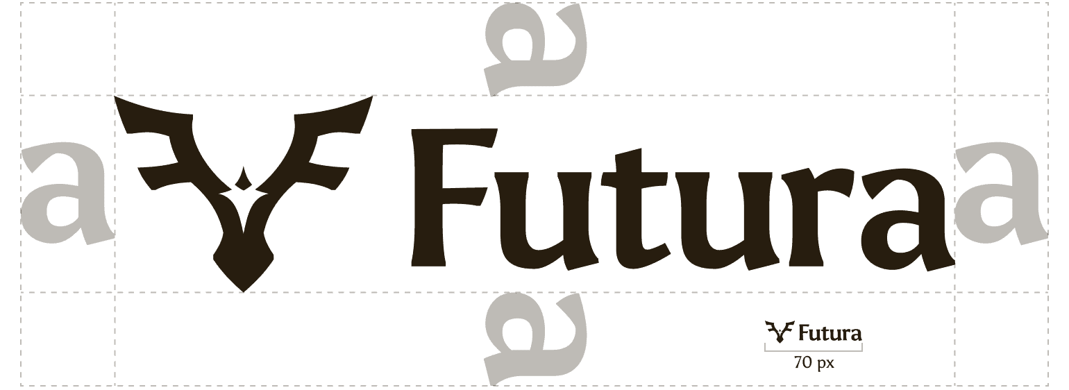
Clearspace defines the minimum area around a logo that must remain free of any other elements, ensuring it stays visible and impactful. Respecting this space keeps the logo from feeling crowded and preserves the strength of your brand.

Minimum size sets how small a logo can appear while remaining clear and readable across different formats. Following these limits ensures your logo always looks sharp and consistent, no matter where it’s used.

Clearspace & Minimal size

View details

Clearspace defines the minimum area around a logo that must remain free of any other elements, ensuring it stays visible and impactful. Respecting this space keeps the logo from feeling crowded and preserves the strength of your brand.

Minimum size sets how small a logo can appear while remaining clear and readable across different formats. Following these limits ensures your logo always looks sharp and consistent, no matter where it’s used.

Clearspace & Minimal size

View details

Clearspace defines the minimum area around a logo that must remain free of any other elements, ensuring it stays visible and impactful. Respecting this space keeps the logo from feeling crowded and preserves the strength of your brand.

Minimum size sets how small a logo can appear while remaining clear and readable across different formats. Following these limits ensures your logo always looks sharp and consistent, no matter where it’s used.

Complete logo clearspace

Complete

Wordmark logo clearspace

Wordmark

Symbol logo clearspace

Symbol

Symbol logo clearspace

Symbol

Things to avoid

View details

Our logo is one of the most recognizable parts of our identity. To preserve its impact, it needs to be applied consistently and correctly at all times.

This section highlights common misuses that affect clarity, recognition, or brand integrity. These examples are strictly prohibited in every situation.

Things to avoid

View details

Our logo is one of the most recognizable parts of our identity. To preserve its impact, it needs to be applied consistently and correctly at all times.

This section highlights common misuses that affect clarity, recognition, or brand integrity. These examples are strictly prohibited in every situation.

Things to avoid

View details

Our logo is one of the most recognizable parts of our identity. To preserve its impact, it needs to be applied consistently and correctly at all times.

This section highlights common misuses that affect clarity, recognition, or brand integrity. These examples are strictly prohibited in every situation.

Thing number one to avoid on the logo

Do not adjust the logo.

Thing number two to avoid on the logo

Do not outline the logo.

Thing number three to avoid on the logo

Do not add effects to the logo.

Thing number three to avoid on the logo

Do not add effects to the logo.

Thing number four to avoid on the logo

Do not use the logo as a mask.

Thing number four to avoid on the logo

Do not use the logo as a mask.

Thing number five to avoid on the logo

Do not rotate the logo.

Thing number six to avoid on the logo

Do not edit the logo.

Thing number seven to avoid on the logo

Do not crop or trim the logo.

Thing number seven to avoid on the logo

Do not crop or trim the logo.

Thing number eight to avoid on the logo

Do not make the logo 3D.

Thing number eight to avoid on the logo

Do not make the logo 3D.

03

Colors

03

Colors

03

Colors

Our warm colors break through the technical coldness. Energetic without being aggressive, warm without being childish. Our color palette creates a visual world that is as versatile as it is inspiring, from app icons to bigger campaigns.

Palette

View details

Building a distinctive and cohesive colour palette is a key part of expressing your brand identity. Your colours will be used consistently across your social media, stationery, website, and more.

On this section, you’ll find the selected colour palette along with guidance on usage and colour specifications.

Palette

View details

Building a distinctive and cohesive colour palette is a key part of expressing your brand identity. Your colours will be used consistently across your social media, stationery, website, and more.

On this section, you’ll find the selected colour palette along with guidance on usage and colour specifications.

Palette

View details

Building a distinctive and cohesive colour palette is a key part of expressing your brand identity. Your colours will be used consistently across your social media, stationery, website, and more.

On this section, you’ll find the selected colour palette along with guidance on usage and colour specifications.

Copy

Copied

Lime
#9BDB60

Copy

Copied

Lime
#9BDB60

Copy

Copied

Lime
#9BDB60

Copy

Copied

Warm Orange
#FFAC26

Copy

Copied

Warm Orange
#FFAC26

Copy

Copied

Warm Orange
#FFAC26

Copy

Copied

Salmon pink
#FC7360

Copy

Copied

Salmon pink
#FC7360

Copy

Copied

Salmon pink
#FC7360

Copy

Copied

Cream White
#79E2A3

Copy

Copied

Cream White
#79E2A3

Copy

Copied

Cream White
#79E2A3

Copy

Copied

Dark Brown
#271D0F

Copy

Copied

Dark Brown
#271D0F

Copy

Copied

Dark Brown
#271D0F

Hierarchy

View details

Colour hierarchy defines how your palette is structured and used to guide attention and create clarity. By assigning clear roles to primary, secondary, and accent colours, you ensure your brand stays balanced and easy to navigate.

Using this hierarchy consistently helps highlight key information while supporting a cohesive visual flow across all applications. It keeps the brand recognizable, organized, and visually strong in every context.

Hierarchy

View details

Colour hierarchy defines how your palette is structured and used to guide attention and create clarity. By assigning clear roles to primary, secondary, and accent colours, you ensure your brand stays balanced and easy to navigate.

Using this hierarchy consistently helps highlight key information while supporting a cohesive visual flow across all applications. It keeps the brand recognizable, organized, and visually strong in every context.

Hierarchy

View details

Colour hierarchy defines how your palette is structured and used to guide attention and create clarity. By assigning clear roles to primary, secondary, and accent colours, you ensure your brand stays balanced and easy to navigate.

Using this hierarchy consistently helps highlight key information while supporting a cohesive visual flow across all applications. It keeps the brand recognizable, organized, and visually strong in every context.

30%
30%
15%
15%
10%

Combinations

View details

Colour combinations define how different tones from your palette work together to create harmony and contrast. Choosing the right pairings ensures your visuals feel balanced, engaging, and aligned with your brand identity.

Using these combinations consistently across your materials helps maintain a strong visual language while highlighting key elements. Thoughtful pairings keep the brand cohesive, dynamic, and easy to recognize in every context.

Combinations

View details

Colour combinations define how different tones from your palette work together to create harmony and contrast. Choosing the right pairings ensures your visuals feel balanced, engaging, and aligned with your brand identity.

Using these combinations consistently across your materials helps maintain a strong visual language while highlighting key elements. Thoughtful pairings keep the brand cohesive, dynamic, and easy to recognize in every context.

Combinations

View details

Colour combinations define how different tones from your palette work together to create harmony and contrast. Choosing the right pairings ensures your visuals feel balanced, engaging, and aligned with your brand identity.

Using these combinations consistently across your materials helps maintain a strong visual language while highlighting key elements. Thoughtful pairings keep the brand cohesive, dynamic, and easy to recognize in every context.

04

Typography

04

Typography

04

Typography

Our typographic system is based on clarity and accessibility. Asul provides structure and personality, while Lato ensures perfect readability in all contexts. Together, they strike a balance between warm modernity and professional efficiency.

Primary typography

View details

Applied to all hero messaging, key statements, and moments that demand attention. Always set in sentence case or lowercase.

Primary typography

View details

Applied to all hero messaging, key statements, and moments that demand attention. Always set in sentence case or lowercase.

Primary typography

View details

Applied to all hero messaging, key statements, and moments that demand attention. Always set in sentence case or lowercase.

Typography Name

Asul

Weight

Regular

Regular

Regular

Bold

Bold

Bold

Special Characters
  • ?!.,:;@£$€¥%#&*()[]

Characters

Aa

Bb

Cc

Dd

Ee

Ff

Gg

Hh

Ii

Jj

Kk

Ll

Mm

Nn

Oo

Pp

Qq

Rr

Ss

Tt

Uu

Vv

Ww

Xx

Yy

Zz

1

2

3

4

5

6

7

8

9

Secondary typography

View details

Applied to all paragraphs, explanations, and descriptive content. Modern and professional with a bit of character.

Secondary typography

View details

Applied to all paragraphs, explanations, and descriptive content. Modern and professional with a bit of character.

Secondary typography

View details

Applied to all paragraphs, explanations, and descriptive content. Modern and professional with a bit of character.

Typography Name

Lato

Lato

Lato

Weight

Light

Light

Light

Regular

Regular

Regular

Bold

Bold

Bold

Black

Black

Black

Special Characters
  • ?!.,:;@£$€¥%#&*()[]

    ?!.,:;@£$€¥%#&*()[]

    ?!.,:;@£$€¥%#&*()[]

Characters

Aa

Bb

Cc

Dd

Ee

Ff

Gg

Hh

Ii

Jj

Kk

Ll

Mm

Nn

Oo

Pp

Qq

Rr

Ss

Tt

Uu

Vv

Ww

Xx

Yy

Zz

1

2

3

4

5

6

7

8

9

Usages

View details

The spacing of the typeface plays a crucial role in keeping text clear and consistent. Adjust tracking and kerning with care to maintain balance and readability.

Use steady leading to preserve hierarchy and ensure a smooth visual flow across all uses. Well-managed spacing keeps the brand looking clean and professional at all times.

Usages

View details

The spacing of the typeface plays a crucial role in keeping text clear and consistent. Adjust tracking and kerning with care to maintain balance and readability.

Use steady leading to preserve hierarchy and ensure a smooth visual flow across all uses. Well-managed spacing keeps the brand looking clean and professional at all times.

Usages

View details

The spacing of the typeface plays a crucial role in keeping text clear and consistent. Adjust tracking and kerning with care to maintain balance and readability.

Use steady leading to preserve hierarchy and ensure a smooth visual flow across all uses. Well-managed spacing keeps the brand looking clean and professional at all times.

Tracking

Line

105%

-0.06 Em

Create without limits

Tracking and leading are perfect

Tracking

Line

80%

-0.08 Em

Create without limits

Create without limits

Tracking and leading are too tight

Tracking

Line

80%

-0.08 Em

Create without limits

Tracking and leading are too tight

Tracking

Line

125%

0 Em

Create without limits

Create without limits

Tracking and leading are too loose

Tracking

Line

125%

0 Em

Create without limits

Tracking and leading are too loose

05

Assets

05

Assets

05

Assets

Every asset in this section, icons, illustrations, and photography, has been designed to embody our promise: to make creativity accessible. Together, they form Futura’s unique visual language, instantly recognizable at a glance.


Illustrations

View details

These are the brand illustrations. Use them where relevant to support messaging or visual. Keep usage intentional and consistent.

Illustrations

View details

These are the brand illustrations. Use them where relevant to support messaging or visual. Keep usage intentional and consistent.

Illustrations

View details

These are the brand illustrations. Use them where relevant to support messaging or visual. Keep usage intentional and consistent.

Illustration number one
Illustration number two
Illustration number three
Illustration number four

Photography

View details

Photography style defines the visual tone of your brand through composition, lighting, and subject treatment. It shapes how your audience feels with your identity across every image.

Using a consistent style across all visuals builds recognition and strengthens your overall brand presence. It ensures every image feels intentional, cohesive, and aligned with the message you want to convey.

Photography

View details

Photography style defines the visual tone of your brand through composition, lighting, and subject treatment. It shapes how your audience feels with your identity across every image.

Using a consistent style across all visuals builds recognition and strengthens your overall brand presence. It ensures every image feels intentional, cohesive, and aligned with the message you want to convey.

Photography

View details

Photography style defines the visual tone of your brand through composition, lighting, and subject treatment. It shapes how your audience feels with your identity across every image.

Using a consistent style across all visuals builds recognition and strengthens your overall brand presence. It ensures every image feels intentional, cohesive, and aligned with the message you want to convey.

Photography style number one

Minimalism

Clean compositions, soft lighting, and use of warm colors. Subjects are highlighted against solid or gradient backgrounds.

Photography style number two

Transformation

Natural light, artistic blurs, moments of transformation. Evokes the creative process in action with warmth.

Photography style number two

Transformation

Natural light, artistic blurs, moments of transformation. Evokes the creative process in action with warmth.

Photography style number three

Creativity

Authentic scenes from everyday life, people at work. Dynamic shots, positive energy. Futura in real-life settings.

Photography style number three

Creativity

Authentic scenes from everyday life, people at work. Dynamic shots, positive energy. Futura in real-life settings.

Create a free website with Framer, the website builder loved by startups, designers and agencies.